Data Mining in KNIME with a Tad of R or a Dash of Python
KNIME is a data analytics platform that can be used for a variety of data science operations. I have discovered it a few months ago and was impressed with its flexibility and the amount of components available.
I believe data science platforms can successfully complement the toolbox of a data scientist. They can be used to empower users with fewer coding skills. They can also shorten the time it takes to do mundane tasks like data ingestion and cleaning.
Typical data mining and basic modelling can be done with only a few mouse clicks, rapidly decreasing the time it takes to quickly asses a data problem. I would not use it for a production grade system, but doing a fast regression on some .csv file can certainly be accomplished successfully with KNIME.

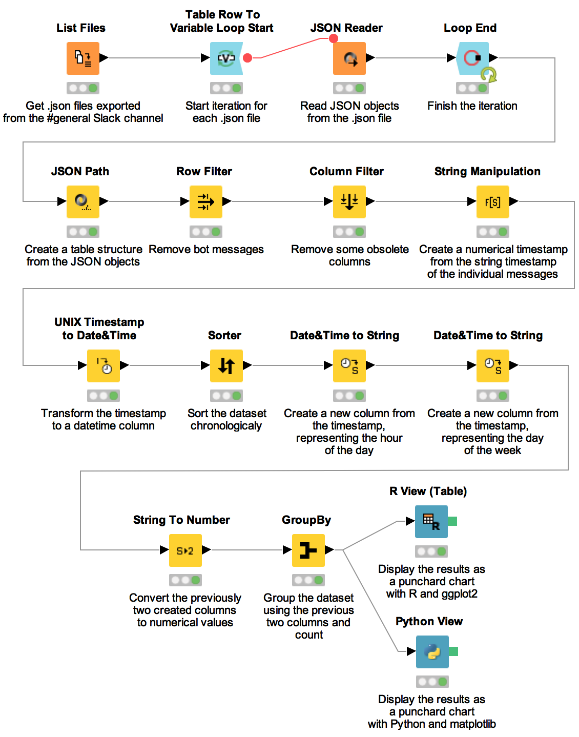
In this post I try to demonstrate KNIME's power by presenting a workflow that takes raw data and produces a punchcard chart from it. All of this requires just using the UI and writing 2 lines of R code or a few lines of Python code. At the end of the workflow we'll have a dataset with 3 columns representing the day, hour and number of messages and we'll use this dataset to plot a chart similar to GitHub's punchcard chart.
Exploring Slack export
This tutorial can be used to analyse any Slack export. One such dataset can be found at here, but you can use your organisation's Slack history for an even more realistic scenario.
Once you have the export on your local hard drive, start KNIME and create a new blank workflow.
Reading in the data
We want to look at the #general channel, but the problem is that that each channel has lots of .json files for each day. To be able to parse the files in KNIME we need to do a series of operations:
- Get the files containing the messages.
- For each file, read its contents.
- Create one big dataset from all the records in the individual files.
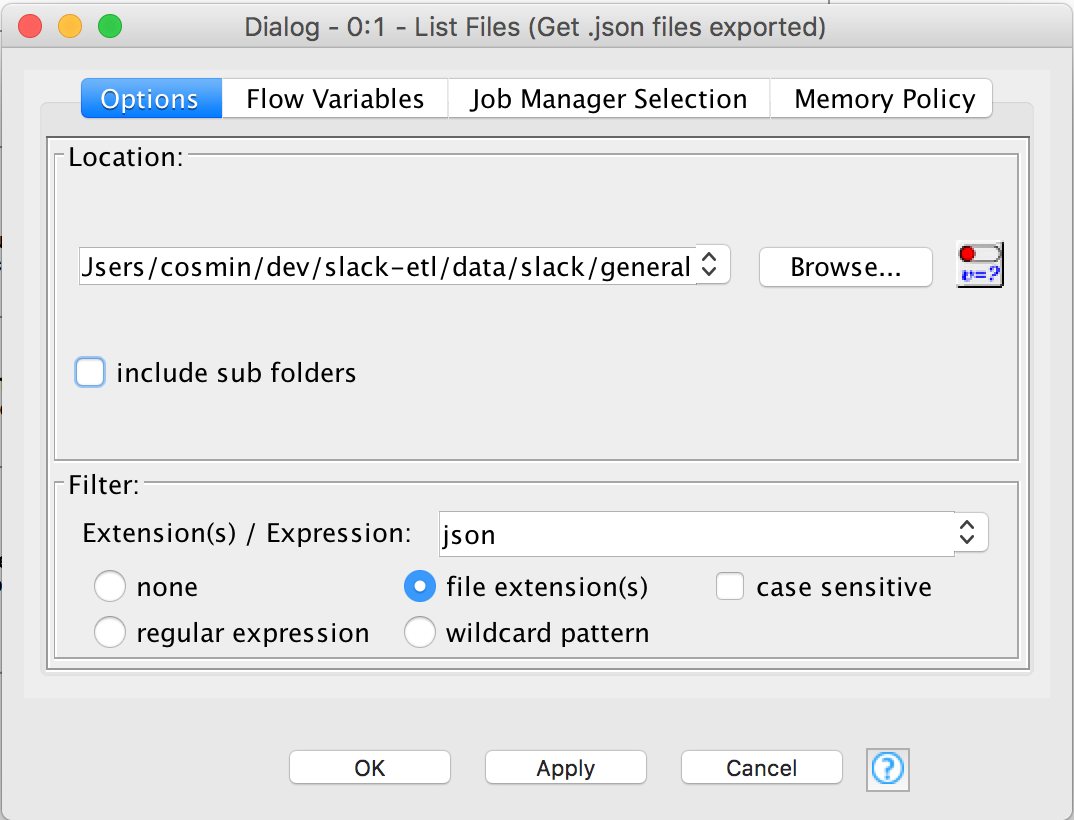
Add a List Files node and configure it by pointing the location to where the .json files of the #general channel are located. This nodes outputs a dataset containing file paths.
Add a Table Row To Variable Loop Start. Connect the List Files node output to the input of Table Row To Variable Loop Start.
Next, add a JSON Reader.
- Right click on it and select
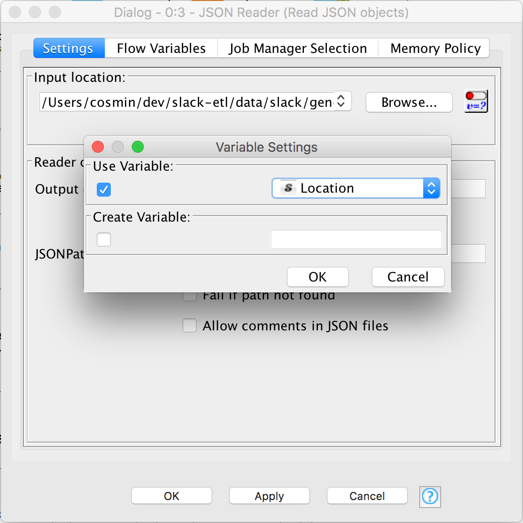
Show Flow Variable Ports. Connect the output fromTable Row To Variable Loop Startto the first flow variable port ofJSON Reader. - Double click on the node to configure it. In the Flow Variables tab, for
json.locationselectLocation. ThisLocationis provided by theList Filesnode output via theTable Row To Variable Loop Startnode. - In the Settings tab click on the button right of the
Browsebutton. In the new dialog window check the first checkbox and selectLocation.
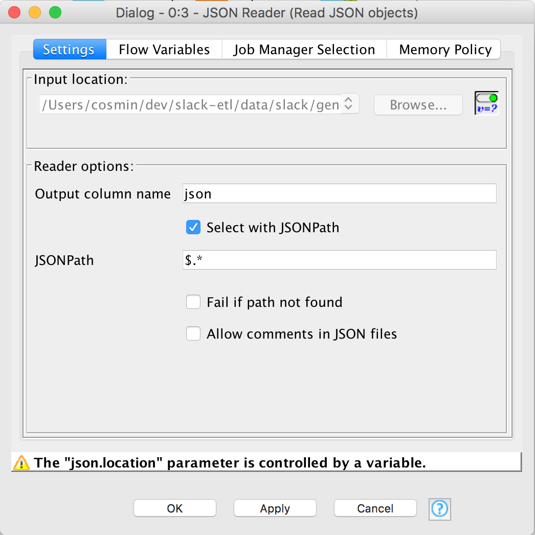
- Make sure the Output column name is set to
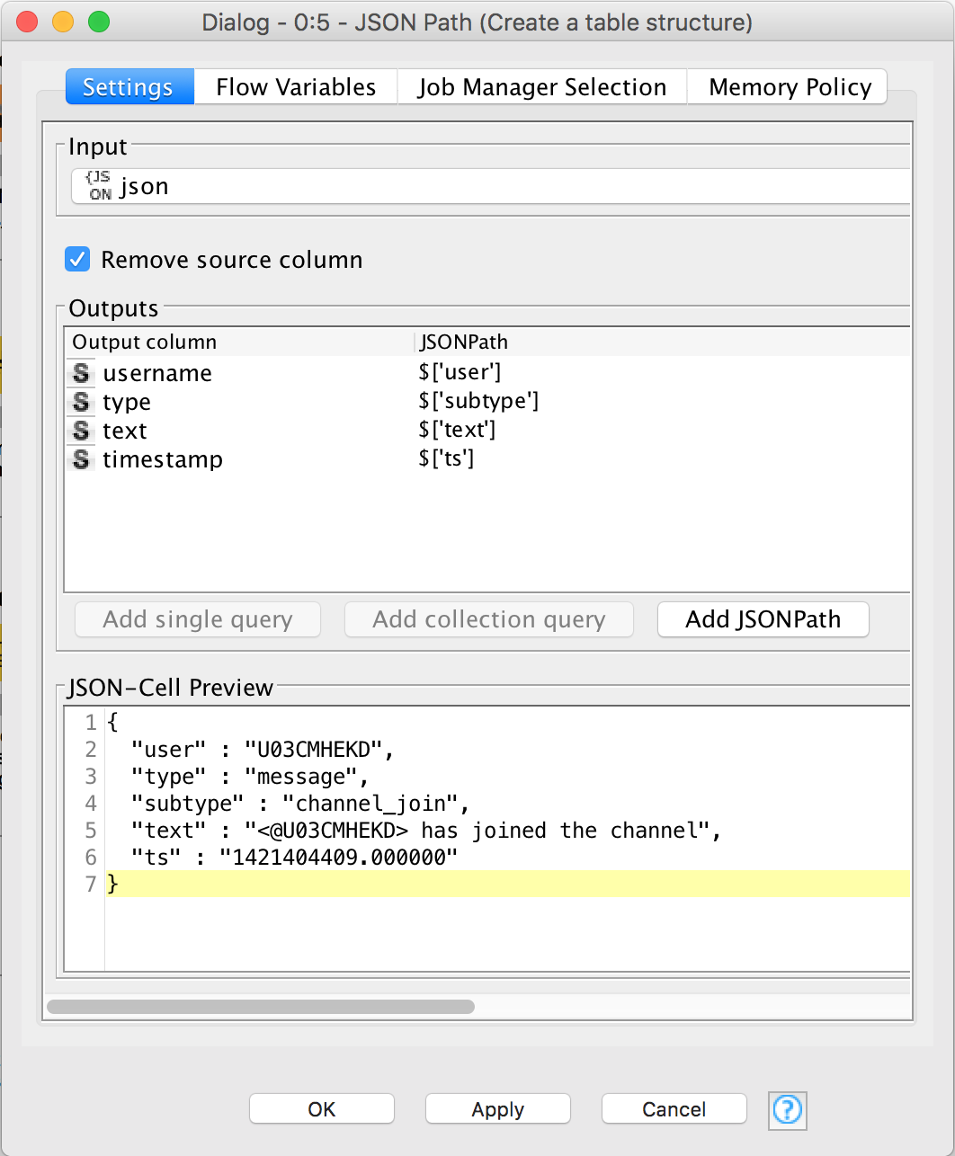
jsonand Select with JSONPath is checked. Also the JSONPath must be set to$.*. TheJSONobjects inside the individual.jsonfiles are structured as arrays and this JSONpath helps us "explode" them.
To finish the iteration of reading the files we now need a Loop End node. Connect the JSON Reader output to the input of Loop End. The default configuration will suffice.
The last part of this section is to transform the individual JSON objects into rows of a dataset. For this we will use the JSON Path node. Connect the output of the Loop End node to the input of the JSON Path. Double click on it to edit it. We need to map the object's properties to a column. This structure is fairly simple to map, just look at the screenshot. You need to use the Add single query button. You'll notice that subtype is mapped to type. That's because all the original types are messages. Also, we'll use the original subtype column to filter out bot's messages.
At this point, we have a typical tabular dataset that we can work with.
Transforming the data
Having the data in some tabular format is, of course, not enough. Now it needs to be transformed and cleaned.
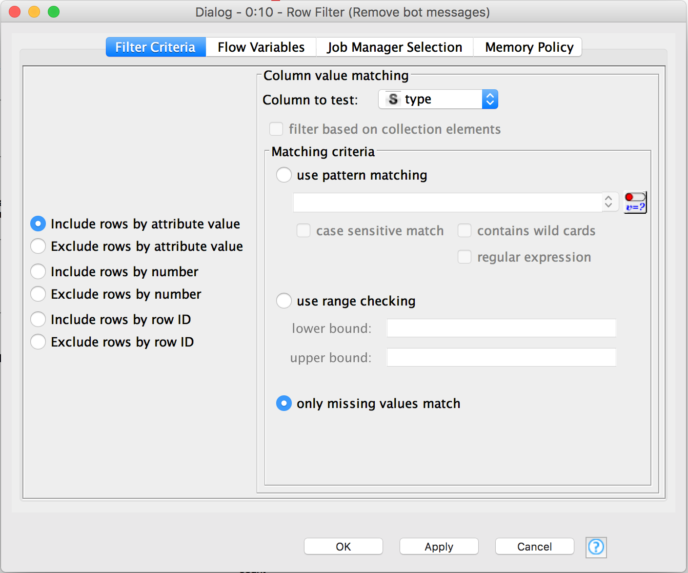
Add a Row Filter node to remove the messages that have a set type (which is aliased from subtype). Messages from users have the type set to null, while bot users have a set type. Connect the output from the JSON Path node to the input of the Row Filter node. Double click on it to configure it. Select Include rows by attribute value, select the type column and only missing values match (a.k.a IS NULL).
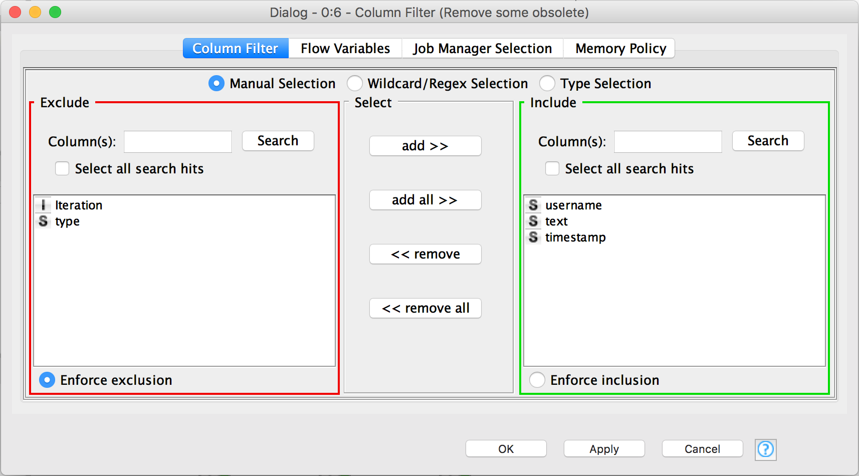
At this point, some columns are not useful at all, like the type and iteration column (created by the 2nd node), so we'll just filter them out with the Column Filter node. As usual, connect the output of the Row Filter node to the input of the Column node. Double click on it to configure it. Select Enforce exclusion and add the two obsolete columns.
For the purpose of this tutorial, the username and text columns are also useless, but what you can do is that you can have multiple parallel workflows using the output of a node. For example you can use the username column to derive a top os users or you can use the text column to run some NLP algorithm.
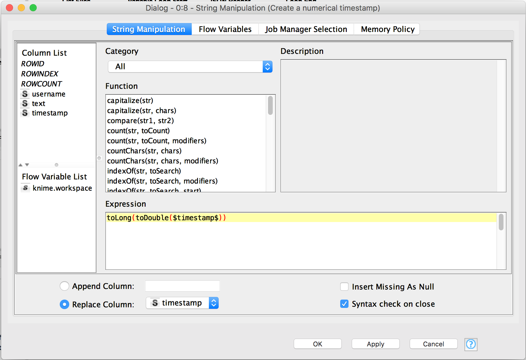
Create a String Manipulation node and connect its input to the output of the Column Filter node. To be able to retrieve days of the week and hours of the day, we need to transform the timestamp from String to Long to DateTime. We start with the first transformation. Double click on the node to configure it. In the Expression text field you need to use the timestamp column and then cast it two times: toLong(toDouble($timestamp$)).
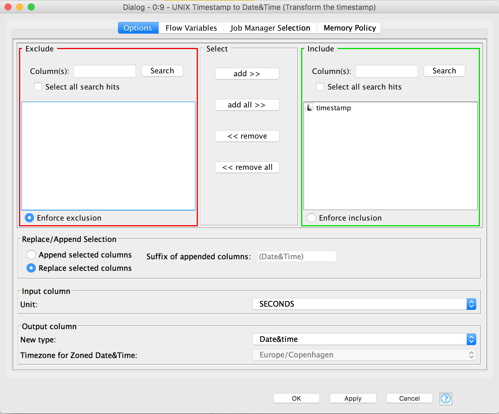
To transform the numerical timestamp to a DateTime column we need to add a UNIX Timestamp to Date&Time. We connect its input to the output of the String Manipulation node. Double click on it to edit it. Make sure the Include selection has timestamp in it, and only timestamp. We'll overwrite the timestamp column with the new values, so select Replace selected columns. The timestamp unit in this case is Seconds and we want the New type to be Date&Time.
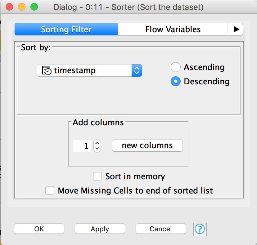
Just for the purpose of looking at data in a nicer way, we can add a Sorter node. Connect the output from the UNIX Timestamp to Date&Time to the input of the Sorter node. Double click on it to configure it and select timestamp and Descending.
By the way, you can inspect the output of most nodes by right clicking on them and selecting the option with the magnifier glass (usually the last one). However, the nodes need to have been executed for this to be available.
Next is to create two subsequent Date&Time to String nodes. These will create two new columns which store the day of the week and the hour of the day. The order in which the nodes are created is not important as long as they are customise.
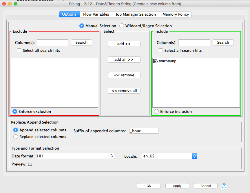
Let's start with the hour of the day. Connect the output of the Sorter node to the input of the first Date&Time to String node. Double click on it to edit it. The include section should only have timestamp in it. Append a new column with the _hour suffix. The format of the new column should be set to HH (the 24 hour format). The locale should probably be set to en_US.
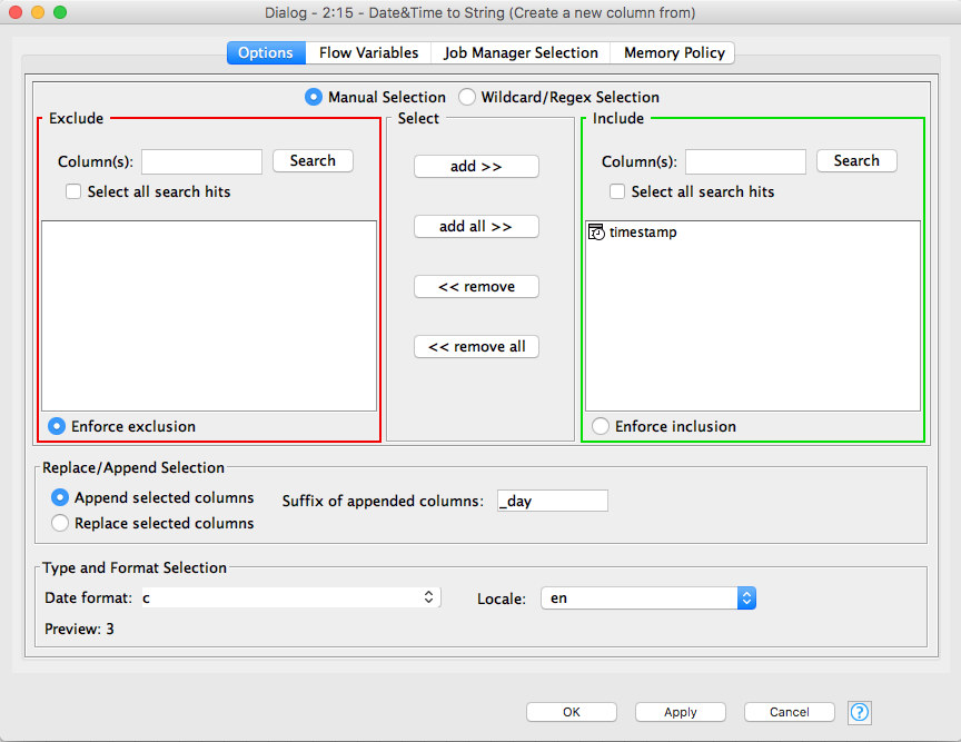
For the day of the week, create another Date&Time to String node that will have its input connected to the output of the first Date&Time to String node. Double click on it to customise it. The include section should only have timestamp in it. Append a new column with the _day suffix. The format of the new column should be set to c (the Sunday first numerical format for the weekday). The locale should be set to en. Unfortunately, I wan not able to find an easy way to have a Monday first format.
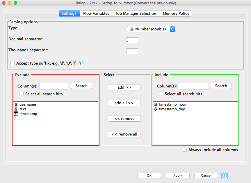
It is easier if we work with numerical data in the charts so we will just convert timestamp_hour and timestamp_day to numerical values. For this, use a String to Number node that receives as input the output of the second Date&Time to String node. Double click on it to customise it and make sure only the timestamp_hour and timestamp_day are in the Include section. The Type should be double.
The last data related step is the aggregation. We will use a Group By node which receives as input the output from the String to Number node. Double click on it to edit it. In the Groups tab, have timestamp_hour and timestamp_day in the Group column(s) section. Column naming should be Aggregation method(column name). In the Manual Aggregation tab, from the Available columns select timestamp and change the Aggregation (click to change) from First to Count.
Visualisation
The last part of the tutorial involves actually displaying useful information graphically. It is also the only part of the tutorial which requires a few lines of code.
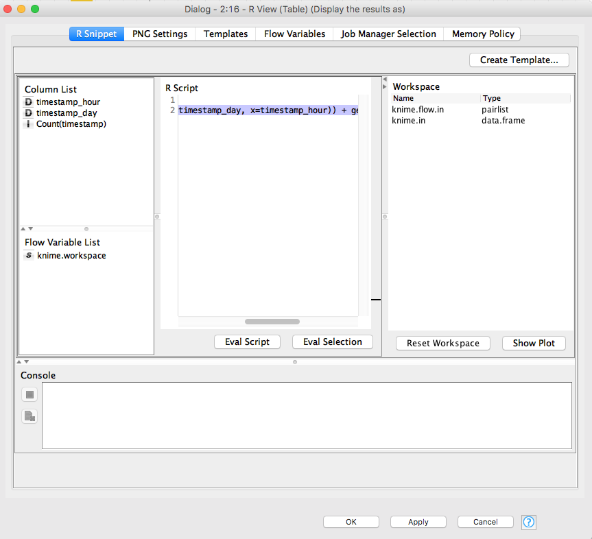
Using R
Using R for displaying the chart is easy. Just add a R View node and connect its input to the output of the Group By node. Double click on it to configure it. In the R script textbox all you need to add is:
library(ggplot2)
ggplot2::ggplot(data.frame(knime.in), aes(y=timestamp_day, x=timestamp_hour)) + geom_point(aes(size=`Count.timestamp.`))
It is important that you do not try to wrap the lines on multiple lines. Also, you need to have R installed and the package ggplot2.
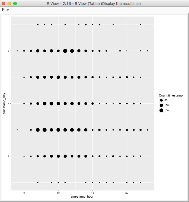
This is the definition of a scatter plot which takes a data.frame as argument and uses the day and hour values for the axes and the size of the points is determined by the Count.timestamp. aggregated column. The bigger the size, the more activity in that time interval. The result is this:
Using Python
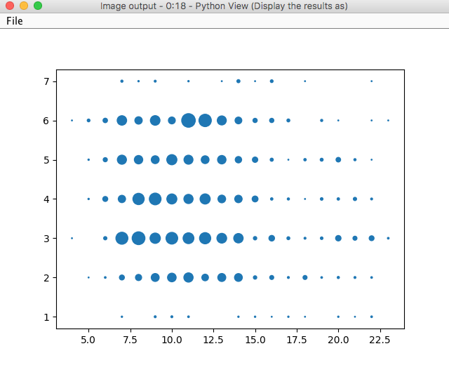
For Python it is very similar. Just add a Python View (do not choose the Labs version). Connect its input to the output of the Group By node. Double click on it to configure it. In the Python script textbox all you need to add is:
from io import BytesIO
import matplotlib.pyplot as plt

data = input_table._get_numeric_data()
plt.scatter(data.timestamp_hour, data.timestamp_day, s=data["Count(timestamp)"])
buffer = BytesIO()
plt.savefig(buffer, format='png')
output_image = buffer.getvalue()
It is important that you do not try to wrap the lines on multiple lines. You have to have matplotlib installed.
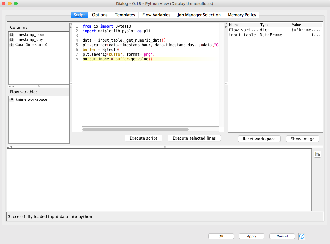
The output image is very similar as for the R version.
End notes
I hope this end-to-end tutorial was easy to follow and to understand. If you have any problems replicating the results, let me know in the comment section or contact me directly.
For reference, here is the exported version of the workflow. You can easily import that even though the data is not provided.